
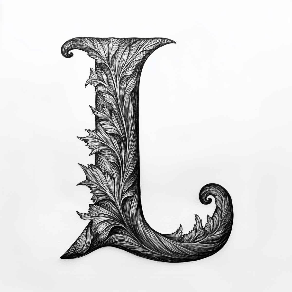
Lettermarks and wordmarks are two distinct types of logos that serve as visual representations of a brand. A lettermark is a logo that consists of the initials of a company or organization, often stylized in a unique way to create a memorable visual identity. For instance, the lettermark "IBM" stands for International Business Machines, and it effectively encapsulates the brand's identity through its abbreviated form.
The simplicity of lettermarks allows for easy recognition and recall, making them particularly effective for companies with lengthy names or those that wish to convey a sense of professionalism and authority. On the other hand, wordmarks are logos that feature the full name of the company, designed in a distinctive typographic style. A prime example of a successful wordmark is Google, where the name itself is rendered in a playful yet straightforward font that reflects the brand's innovative spirit.
Wordmarks can be particularly powerful because they communicate the brand's name directly to the audience, fostering familiarity and trust.
Both lettermarks and wordmarks play crucial roles in establishing a brand's identity, but they do so through different visual strategies.
Lettermarks and wordmarks Key Takeaways
- Lettermarks are logos that consist of the initials of a company's name, while wordmarks are logos that spell out the full name of the company.
- Lettermarks and wordmarks are important in branding because they help to create a strong visual identity for a company and make it easily recognizable.
- Successful examples of lettermarks and wordmarks include IBM's iconic lettermark and Coca-Cola's distinctive wordmark.
- When designing lettermarks and wordmarks, it's important to keep them simple, memorable, and reflective of the brand's personality.
- The main difference between lettermarks and wordmarks is that lettermarks use initials, while wordmarks use the full name of the company.
The Importance of Lettermarks and Wordmarks in Branding
The significance of lettermarks and wordmarks in branding cannot be overstated. They serve as the cornerstone of a brand's visual identity, providing immediate recognition and differentiation in a crowded marketplace. A well-designed lettermark or wordmark can encapsulate the essence of a brand, conveying its values, mission, and personality through visual elements alone.
This is particularly important in an age where consumers are bombarded with countless messages daily; a strong logo can cut through the noise and create a lasting impression. Moreover, lettermarks and wordmarks contribute to brand consistency across various platforms and mediums. Whether on a business card, website, or social media profile, having a cohesive visual identity helps reinforce brand recognition.
This consistency builds trust with consumers, as they come to associate specific visual elements with the quality and reliability of the brand. In essence, lettermarks and wordmarks are not just decorative elements; they are strategic tools that can significantly influence consumer perception and loyalty.
Examples of Successful Lettermarks and Wordmarks

Several brands have successfully utilized lettermarks and wordmarks to establish their identities and resonate with their target audiences. For instance, the lettermark "CNN" is instantly recognizable worldwide, representing the Cable News Network. The simplicity of the three letters allows for easy recall, while the bold typography conveys authority and reliability in news reporting.
Similarly, "HBO" serves as another example of an effective lettermark, where the initials evoke a sense of prestige associated with high-quality entertainment. In contrast, wordmarks like "Coca-Cola" exemplify how a distinctive typographic style can create an emotional connection with consumers. The flowing script of the Coca-Cola logo is not only visually appealing but also evokes nostalgia and happiness, aligning perfectly with the brand's messaging.
Another notable example is "FedEx," where the clever use of negative space between the "E" and "x" creates an arrow, symbolizing speed and precision—qualities that are central to the brand's identity. These examples illustrate how both lettermarks and wordmarks can effectively communicate a brand's essence while ensuring memorability.
Tips for Designing Effective Lettermarks and Wordmarks
Designing effective lettermarks and wordmarks requires careful consideration of various elements to ensure they resonate with the target audience. One crucial tip is to prioritize simplicity. A clean and straightforward design is more likely to be remembered than a complex one.
For instance, consider the lettermark "NASA," which uses bold letters to create an impactful presence without unnecessary embellishments. This simplicity allows for easy recognition across different contexts. Another important aspect is to ensure that the typography aligns with the brand's personality.
A tech company might opt for sleek, modern fonts to convey innovation, while a luxury brand may choose elegant serif fonts to evoke sophistication. Additionally, color choice plays a vital role in logo design; colors can evoke specific emotions and associations. For example, blue often conveys trustworthiness, making it a popular choice for financial institutions.
By thoughtfully considering these design elements, brands can create lettermarks and wordmarks that effectively communicate their identity.
The Difference Between Lettermarks and Wordmarks
While both lettermarks and wordmarks serve as logos for brands, they differ fundamentally in their composition and purpose. Lettermarks focus on using initials or abbreviations to represent a brand, which can be particularly advantageous for companies with long or complex names. This approach allows for a streamlined visual identity that is easy to recognize and remember.
In contrast, wordmarks utilize the full name of the brand, emphasizing clarity and direct communication with consumers. The choice between using a lettermark or wordmark often depends on various factors, including brand length, target audience, and overall branding strategy. For instance, startups or new companies may prefer wordmarks to establish their name in the market clearly.
In contrast, established brands with recognizable initials may opt for lettermarks to leverage their existing reputation while simplifying their visual identity. Understanding these differences is crucial for businesses looking to create an effective logo that aligns with their branding goals.
How to Choose Between Lettermarks and Wordmarks for Your Brand

Choosing between a lettermark and a wordmark involves evaluating several key factors related to your brand's identity and objectives. One primary consideration is the length of your brand name; if it is lengthy or difficult to pronounce, a lettermark may be more effective in creating a memorable logo. For example, "American International Group" successfully uses the lettermark "AIG" to simplify its branding while maintaining recognition.
Another factor to consider is your target audience's preferences and expectations. If your audience values clarity and straightforwardness, a wordmark may be more appropriate as it directly communicates your brand name. Conversely, if your audience appreciates modernity or minimalism, a lettermark could resonate better with them.
Additionally, consider how each option will perform across various platforms—lettermarks may be more versatile in smaller formats like social media icons, while wordmarks can shine in larger applications like signage or advertisements.
Common Mistakes to Avoid When Creating Lettermarks and Wordmarks
When designing lettermarks and wordmarks, several common pitfalls can hinder their effectiveness. One frequent mistake is overcomplicating the design with excessive details or intricate typography. While creativity is essential in logo design, overly complex logos can become difficult to reproduce across different mediums or sizes.
For instance, logos that rely heavily on fine details may lose clarity when scaled down for business cards or digital avatars. Another common error is neglecting to consider how the logo will appear in various contexts.
A logo should be versatile enough to work on different backgrounds and materials without losing its impact.
Additionally, failing to conduct thorough research on existing logos can lead to unintentional similarities with competitors or established brands, which can confuse consumers or even lead to legal issues. By avoiding these mistakes and focusing on clarity and versatility, brands can create effective lettermarks and wordmarks that stand out in their respective markets.
The Evolution of Lettermarks and Wordmarks in Modern Branding
The evolution of lettermarks and wordmarks reflects broader trends in design philosophy and consumer behavior over time. In recent years, there has been a noticeable shift towards minimalism in branding, with many companies opting for simpler designs that prioritize clarity over complexity. This trend has led to an increase in the popularity of lettermarks as brands seek to create easily recognizable logos that can be quickly identified by consumers.
Moreover, advancements in technology have influenced how brands approach logo design. With digital platforms becoming increasingly important for marketing and communication, logos must be adaptable across various devices and screen sizes. This has prompted many brands to rethink their visual identities to ensure they remain effective in both print and digital formats.
As consumer preferences continue to evolve alongside technological advancements, it will be fascinating to see how lettermarks and wordmarks adapt to meet these changing demands while maintaining their core purpose of representing brands effectively.
If you're interested in exploring more about the nuances of logo design, particularly focusing on the selection of symbols which is crucial for both lettermarks and wordmarks, you might find the article "How to Pick the Perfect Logo: Symbol Selection" insightful. It delves into the strategic considerations behind choosing symbols that align with brand identity and audience perception. You can read more about it by visiting How to Pick the Perfect Logo: Symbol Selection. This resource is particularly useful for designers looking to refine their approach to creating memorable and effective logos.
FAQs
What are lettermarks and wordmarks?
Lettermarks and wordmarks are types of logos that consist of either a single letter or a word, typically the initials of a company or organization. They are a form of typography-based logo design.
What is the difference between lettermarks and wordmarks?
The main difference between lettermarks and wordmarks is that lettermarks consist of a single letter, while wordmarks consist of a full word or the full name of a company or organization. Both types of logos focus on typography and are used to represent a brand.
How are lettermarks and wordmarks used in branding?
Lettermarks and wordmarks are used in branding to create a strong visual identity for a company or organization. They are often used on various marketing materials, such as business cards, websites, and advertisements, to help establish brand recognition.
What are the benefits of using lettermarks and wordmarks in branding?
Lettermarks and wordmarks are beneficial in branding because they are simple, memorable, and versatile. They can be easily recognized and are effective in communicating the name of a company or organization.
Can lettermarks and wordmarks be trademarked?
Yes, lettermarks and wordmarks can be trademarked if they are unique and distinct enough to be identified with a specific company or organization. It is important to conduct a trademark search to ensure that the chosen lettermark or wordmark is not already in use by another entity.

No Comments.