

Wordmark logos are a distinctive type of logo that primarily focuses on the name of a brand or company, utilizing typography as the main design element. These logos are characterized by their simplicity and clarity, often employing custom fonts or unique typographic treatments to create a memorable visual identity. A prime example of a successful wordmark logo is Google.
The tech giant's logo features a clean, sans-serif typeface with vibrant colors that reflect its innovative and approachable nature. The straightforward design allows for easy recognition and recall, making it an effective branding tool. The effectiveness of wordmark logos lies in their ability to convey the brand's identity through text alone.
This type of logo is particularly beneficial for companies with distinctive names that can stand alone without additional imagery. For instance, Coca-Cola's logo is another iconic example of a wordmark, utilizing a flowing script that evokes a sense of nostalgia and tradition. The unique lettering style not only differentiates the brand from competitors but also creates an emotional connection with consumers.
By focusing on the name itself, wordmark logos can establish a strong brand presence in the marketplace.
Different types of logos Key Takeaways
- Wordmark logos are based on the company's name and are designed using unique fonts and typography.
- Lettermark logos are created using the initials of the company's name and are often used to create a visually appealing and memorable logo.
- Emblem logos incorporate the company name within a symbol or icon, creating a traditional and classic look.
- Abstract logos use geometric shapes and symbols to represent the brand, often conveying a sense of creativity and innovation.
- Mascot logos feature a character or figure to represent the brand, often used to create a friendly and approachable image.
Lettermark logos
Lettermark logos, also known as monogram logos, are designed using the initials of a brand or company rather than its full name. This approach is particularly useful for businesses with lengthy or complex names, as it simplifies the visual representation while maintaining brand recognition. A notable example of a lettermark logo is IBM, which uses its three-letter abbreviation in a bold, geometric font.
The simplicity of the design allows for easy identification and recall, making it an effective branding strategy for a global technology leader. The design of lettermark logos often involves creative typography and unique arrangements of letters to create a visually appealing and memorable mark. For instance, the lettermark for HBO employs a bold, sans-serif font that conveys strength and reliability, aligning with the brand's reputation for high-quality entertainment.
By distilling the brand down to its initials, lettermark logos can create a sense of sophistication and professionalism, making them particularly popular among corporate entities and luxury brands.
The challenge lies in ensuring that the initials are distinctive enough to stand out in a crowded marketplace while still being easily recognizable.
Emblem logos

Emblem logos combine text and imagery within a single cohesive design, often resembling badges or seals. This type of logo is characterized by its intricate details and can convey a sense of tradition and authority. Emblem logos are commonly used by organizations such as schools, government agencies, and sports teams, where the combination of text and imagery can evoke a sense of pride and belonging.
A classic example is the Harley-Davidson logo, which features a shield shape with the brand name prominently displayed alongside iconic imagery associated with motorcycles. The design of emblem logos often requires careful consideration of both the text and visual elements to ensure they work harmoniously together. The use of intricate details can enhance the logo's visual appeal but may also pose challenges in terms of scalability and legibility.
For instance, the emblem logo for the NFL incorporates both the league's initials and a stylized football, creating a strong visual identity that resonates with fans. Emblem logos can effectively communicate a brand's heritage and values, making them an excellent choice for organizations looking to establish a strong connection with their audience.
Abstract logos
Abstract logos utilize geometric shapes, colors, and forms to create a unique visual representation of a brand without relying on recognizable imagery or text. This type of logo allows for greater creative freedom and can convey complex ideas or emotions through abstract design elements. A well-known example of an abstract logo is the Nike swoosh, which symbolizes movement and speed while remaining open to interpretation.
The simplicity of the swoosh allows it to be easily recognized and associated with the brand's core values. The power of abstract logos lies in their ability to evoke feelings and associations without being tied to specific imagery. This can be particularly advantageous for brands seeking to differentiate themselves in competitive markets.
For instance, the logo for Pepsi employs an abstract circular design that represents energy and dynamism, aligning with the brand's youthful image. Abstract logos can also adapt well across various mediums and applications, making them versatile choices for modern branding strategies. However, creating an effective abstract logo requires a deep understanding of the brand's identity and target audience to ensure that the design resonates on an emotional level.
Mascot logos
Mascot logos feature illustrated characters or figures that represent a brand, often embodying its personality and values in a playful or engaging manner. These logos are particularly effective for brands targeting younger audiences or those seeking to create a friendly and approachable image. A prime example is the Geico Gecko, which serves as both a mascot and logo for the insurance company.
The character's friendly demeanor and memorable design have made it an integral part of Geico's branding strategy. The use of mascot logos allows brands to create relatable personas that can connect with consumers on an emotional level. For instance, Tony the Tiger has become synonymous with Kellogg's Frosted Flakes cereal, embodying qualities such as energy and enthusiasm that resonate with children and parents alike.
Mascots can also be utilized in marketing campaigns, merchandise, and social media interactions, further enhancing brand engagement. However, developing an effective mascot logo requires careful consideration of character design, personality traits, and how well it aligns with the overall brand message.
Pictorial logos
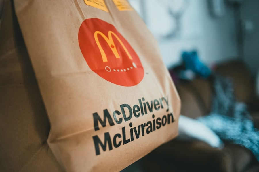
Pictorial logos utilize recognizable images or symbols to represent a brand visually. These logos often feature illustrations or icons that convey specific meanings or associations related to the brand's products or services. A classic example is the Apple logo, which features a simple apple silhouette with a bite taken out of it.
This iconic design not only represents the brand's name but also evokes feelings of innovation and simplicity associated with its products. The strength of pictorial logos lies in their ability to communicate complex ideas quickly and effectively through visual representation. For instance, the World Wildlife Fund (WWF) uses a panda as its pictorial logo, symbolizing conservation efforts and raising awareness about endangered species.
The use of imagery allows brands to create strong associations in consumers' minds, making it easier for them to recall the brand when they encounter similar visuals in other contexts. However, designing an effective pictorial logo requires careful consideration of how well the image aligns with the brand's identity and values.
Combination logos
Combination logos merge both text and imagery into a single cohesive design, allowing brands to leverage the strengths of both elements for maximum impact. This type of logo provides flexibility in branding by enabling companies to use either the text or image independently while still maintaining brand recognition. A well-known example is the Burger King logo, which features both the brand name in bold typography alongside an illustration of a burger within a circular shape.
The versatility of combination logos makes them particularly appealing for businesses looking to establish a strong visual identity while ensuring clarity in communication. For instance, Adidas employs a combination logo featuring its iconic three stripes alongside its name, reinforcing brand recognition across various product lines. This approach allows brands to convey their message effectively while also creating memorable visual associations that resonate with consumers.
However, achieving balance between text and imagery is crucial; if one element overshadows the other, it may dilute the overall impact of the logo.
Dynamic logos
Dynamic logos are designed to be flexible and adaptable, allowing them to change form or appearance based on context or application while still retaining core elements that ensure brand recognition. This innovative approach reflects modern branding strategies that prioritize engagement and interaction with consumers across various platforms. A notable example is Google’s dynamic logo, which frequently changes its appearance for special events or holidays while maintaining its recognizable color scheme and typography.
The adaptability of dynamic logos enables brands to stay relevant in an ever-evolving marketplace by allowing them to respond creatively to trends or cultural moments.
For instance, MTV has utilized dynamic logos throughout its history by altering its design based on different programming themes or campaigns while keeping its core identity intact.
This approach not only captures attention but also fosters deeper connections with audiences by reflecting their interests and values in real-time.
However, creating an effective dynamic logo requires careful planning to ensure that changes do not compromise brand integrity or recognition over time.
If you're exploring the different types of logos and their impact on branding, you might find the article "Crafting a Successful Logo Branding Strategy" particularly enlightening. It delves into how a well-designed logo plays a crucial role in building a memorable and effective brand identity. This resource offers insights into the strategic considerations behind choosing the right type of logo to represent your brand's values and appeal to your target audience. You can read more about it by visiting Crafting a Successful Logo Branding Strategy.
FAQs
What are the different types of logos?
There are several different types of logos, including wordmarks, lettermarks, brandmarks, combination marks, and emblems. Each type of logo has its own unique characteristics and is used to convey different aspects of a brand's identity.
What is a wordmark logo?
A wordmark logo is a type of logo that consists of the company's name in a stylized font or typography. This type of logo is often used when the company's name is distinctive and easily recognizable, such as Coca-Cola or Google.
What is a lettermark logo?
A lettermark logo is a type of logo that consists of the company's initials or acronym, typically stylized in a unique way. This type of logo is often used when the company's name is long or difficult to pronounce, such as IBM or HBO.
What is a brandmark logo?
A brandmark logo is a type of logo that consists of a symbol or icon that represents the brand, without including the company's name. This type of logo is often used when the symbol itself is highly recognizable and can stand alone to represent the brand, such as the Apple logo or the Nike swoosh.
What is a combination mark logo?
A combination mark logo is a type of logo that combines a wordmark or lettermark with a brandmark. This type of logo is often used to create a strong visual identity for the brand, by combining the company's name with a symbol or icon that represents the brand.
What is an emblem logo?
An emblem logo is a type of logo that consists of the company's name and symbol or icon, typically enclosed within a shape or container. This type of logo is often used to create a traditional and classic look, such as the Harley-Davidson logo or the Starbucks logo.

No Comments.